Topic:
Modern Website Design
In the fall of last year, we embarked upon a journey to redesign our website. The site was several years old, outdated, and no longer truly represented the services we offered. It was one of those things that whenever we would look at our site, and then look at what we were doing for our clients, there was no comparison.
The website needed a complete overhaul, and we needed to fix it and fast! Unfortunately, as any business owner will tell you, clients always come first, and time to work on your own business is not always possible. Knowing time would be scarce, we decided to take our time with this project. As a result, it took us longer to complete the design and development versus the typical process for clients, but we are bordering on euphoric with the end result. Please enjoy our story, and we hope you gain insights into the many details behind a modern website design.
You have heard the colloquialism, "Eat Your Own Dog Food," which describes a company using its products or services for its internal use. Of course, that is what we did. We followed the same process as we would have for any client that wanted an inbound marketing optimized website that would be tuned for conversion of visitors into leads and representing their company value in the most impactful and differentiated way. Everything begins with a consultation where we learn about the company, their objectives for the website and the goals for their business.

Image copyright: 123RF Stock Photo
Every business is different. The way they sell, the way their customers perceive them, their differentiation, their strengths and their goals are all unique. When we think about a website, we think first about how a client sells their product or solution successfully. After all, a successful sales motion is the element that a business must support and replicate using their website. In most cases, we accomplish the consultation by developing a finely tuned inbound marketing content strategy for the client's business.
You have heard the statistics that sales efficiency has dropped because the modern buyer has gained control of the sales process since so much content is available to them online and search tools make it so very easy for them to find the solutions they need. The part of the sales process that has stymied most sales teams is the early part of the engagement process when the buyer is researching solutions. In the old days, prospects would call companies to learn about solutions. Now they perform research on-line. This early stage is so critical because that is when they establish biases about the best businesses and solutions.
Inbound Marketing addresses the sales gap by creating content and optimizing the delivery of it to be found in on-line search and nurtures the prospect until they are ready to engage with sales. So, how does this important point support the sales process with a website? You have to think about the sales process and architect the website to support the information flow that the prospect needs at each stage of their journey for information.
Begin with a content strategy for your business to ensure you are addressing the information needs of your ideal buyer.
Common sense tells you that if you don't start with a clear strategic plan, the results of your work will not produce its intended results. That is why businesses should first decide what information should be communicated and which pages should provide the information.
 Home pages should be thought of as a jumping off point for the website, and they should make it clear at the very beginning, who you are and what you do. We have seen so many website home pages where it is entirely unclear what product, service or solution a business provides. As you scroll down the page, consider a flow of information that links to your products and services, markets served and social proof. Consider first the important point made above about your typical sales process and be sure to include elements on the home page that link to specific pages that support that process.
Each page content should be educational and include content at each stage of the buyer's journey (Awareness, Consideration, and Decision.) Follow this process for each page, think of this process as defining the purpose of each element of each page. We call this document, a "website purpose map".
Modern website designs are typically long flowing pages because that style works well for mobile viewers. Our clients monitor the statistics that show which platform visitors are using to view sites and all experience greater than 50% of visits from mobile devices.
By documenting the information flow on each page and determining which stage of the buyer's journey each page element is addressing, your team can more easily collaborate and refine the user experience well before the site moves into the design phase.
If you have researched the Inbound Methodology, then you know that each visitor to your website is in a particular buyer's journey stage and looking for information your business is providing that aligns with that stage. If they don't find it, they will move onto another site that does, perhaps one of your competitors.
You should solve for the customer by answering the question; How do they want to engage with content in each section of every website page? The site architecture should also include decision-stage offers that align with how your company wants sales to engage with prospects. Do they want to do an assessment or a free quote, or value added analysis of their process? By offering specific decision-stage offers, you can capture information that provides sales with a head start before the first call with a prospect.
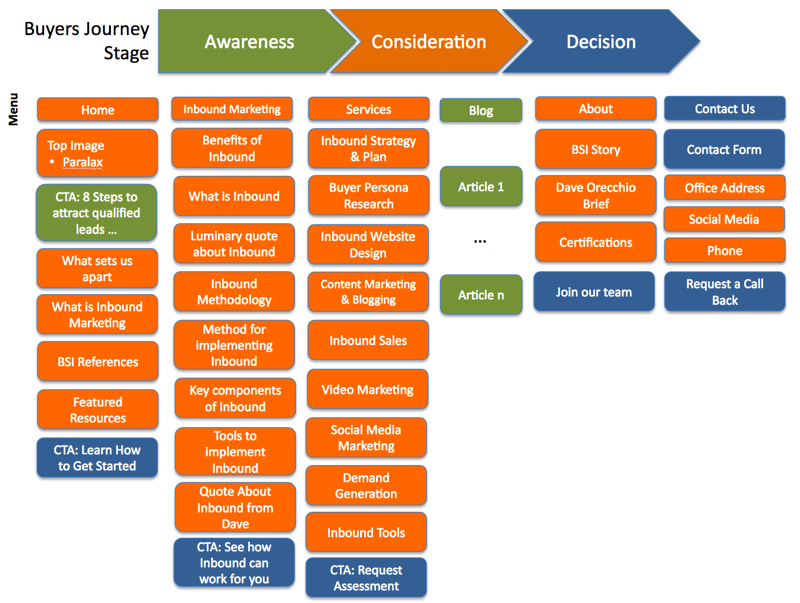
The following is a summary image of the website purpose map for the new Bristol Strategy website. Notice the color coding for buyer's journey stages where green is awareness; orange is consideration and blue are decision. You will notice that most of the information segments on the website are at the consideration stage, and you would be correct. The prominence of consideration content is because the majority of any business website describes their products or services offerings.
We intersperse educational awareness stage offers on pages to encourage visitors to engage by downloading the material and educate themselves about our point of view about topics that matter to them. We capture these themes by creating a finely tuned content strategy for each business. The purpose map graphic expands into a larger document for each page. In this example, the services pages extend to full-length pages not shown in this graphic.
 Bristol Strategy Website Purpose Map
By mapping out the information flow for each and every page, team members do not get hung up on the content but instead focus on the story. The flow of information is crucial for long and flowing website pages.
Modern website design, the part that expresses your company brand is the next stage. Recall that we did not start the discussion about the new site with; "What do we want it to look like?" Instead, we focused on the functionality of the site and inbound marketing best practices. This approach ensures an efficient implementation, an optimized user experience flow, and a site that will generate qualified leads for your business.
 When choosing a designer, look for a creative person with experience in Inbound Marketing. This approach ensures the design does not inhibit user engagement. Subtle changes in design can increase or decrease user conversion rates from visitors into leads. A designer with inbound experience will intuitively include the attributes that improve conversion rates. Our designers take the information from the website purpose map and the page content and create designs, starting with the home page. Once they finalize the core design elements for the home page, then the design of the other pages can proceed productively.
We use a web tool called Invision for sharing mockups and gathering design feedback from clients. Although these mock-ups are static renderings of each page, we have the ability to include navigation from one page to another so the customer can experience some of the site behavior before we get into the implementation phase.
The design phase is iterative because we find that many clients have a difficult time describing their wants and needs but can readily explain what they do not like. It is kind of like writing a term paper in college, and you just need to get the first paragraphs on paper and then you can be productive. The same is true for design, which is very subjective. By starting with several great concepts, clients have the ability to share likes and dislikes while we iterate on a final design.
The website design phase must reinforce your brand image while providing the functional requirements of an inbound marketing optimized website.
Each stage of a modern website redesign process requires attention to detail. That includes the input of the textual and graphical content for each page. We help the customer's team capture all of the information required for each page using web page input documents that include input requests for each section of each page as directed in the website purpose map, including the metadata.
 This input structure enables the client to get creative with the content while differentiating their business and product offerings. We never recommend creating content in a manner that stuffs keywords for search engines. Instead, we guide our clients to create content for their buyer persona. Write for a real person, not a machine. Search engines now factor in visitor behavior. Therefore anything you do that causes visitors to leave your page early (including keyword stuffing) will negatively impact search rank.
Because the website development team has taken care to map out the information flow (above in the website purpose map) they are freed to create compelling content for each section of each page knowing full well that each content block fits together like a puzzle.
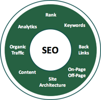
Before we migrate the new content to the website, we perform keyword analysis and plan the on-page SEO. We come back later and "instrument" each page with the target on-page SEO in a way that flows smoothly for each visitor and does not disrupt the story.
 If you are doing a redesign of your website, then you may have performed keyword research in the past and already have a set of target keywords for your site. It is always a good idea to repeat the process because nothing remains constant on the internet and you may find new target keywords (I like to call "Key Phrases") that may produce better results for your business. It is a good idea to create a report of the pages that already rank for keywords to ensure you do not disrupt that hard earned success. Then research other keywords that are relevant to your business and the ranking difficulty is less than 65.
On-page SEO is one of the most important (but invisible) steps of any modern website design. It is invisible because when the website is complete, visitors focus on the look and feel of the website but not the underlying meta data that ensures the site is found by search engines.
Most website development projects begin with a template designed for your hosting platform. Wordpress is an example of a content management system that supports the use of templates. There are many others as well. Because we are focused on delivering inbound marketing optimized websites, we prefer the Hubspot platform because all of the analytics are very well integrated into the website pages, landing pages, email, social media, blog, etc. Virtually everything you would want to measure is available on the platform, and you know that measurement is the key to inbound marketing success. Besides, the Hubspot platform is secure because of the way they host websites.
 If you are beginning with a template for the site, there will always be coding required (both CSS, HTML and JavaScript) to ensure the site follows your brand identity and does not look like hundreds of other websites on the internet. It should be as individual as you and your company. The team that codes the site will implement the style created in the design step above. You should be able to provide them with the Adobe Illustrator (or other) mockups, and they should have the ability to create the site on any platform. Because of the commodity nature of website coding, we have developed relationships with several off-shore design and implementation companies for cost-effective implementation.
Factor in site speed up and secure SSL into your hosting and coding plan. Google and other search engines are beginning to penalize websites which are not secure, meaning they encrypt the data flow between the web server and the visitor's browser. Additionally, Google is decreasing the rank for slow websites, both on mobile and desktop. Be sure to plan and include these two steps in your web hosting and coding plan up front, so it is not a surprise later.
Website coding is a commodity process but requires adequate specifications up-front to ensure the result meets or exceeds your expectations.
I can tell you that regardless of who codes the website, technical issues will always arise. Plan for several testing - coding iterations during the implementation phase. Also, expect to find website and platform specific issues. As much as we would all like to believe that the web browsers and the Internet are ubiquitous and consistent, they are not. It is amazing the number of issues found between PC Internet Explorer, Google Chrome, MAC Safari, Android, iPhone, iPad and others. There is no substitute for testing.
 The other element of website testing is of the text on each and every page. Regardless of how detailed the content creators are because they have been staring at the same text over and over again, they will miss simple grammatical and other errors. It is best to have someone other than the site editor review the site content completely for consistency and flow. Testing is not an exciting part of a website implementation, but like any software project, it is necessary.
It is worth mentioning that the website development phase should have a staging web host so that as you are building and testing the site, you do not upset the existing public website. There are methodologies to approach this with most website systems, Hubspot calls it "content staging" and provides the ability to replace existing site pages and add new ones simultaneously on the launch date.
Website testing is the most important step before bringing the website live.
It may seem like a repetitive step, however, when you launch the site, and it is now public, it is imperative to retest the site thoroughly and especially test all of the website links. The testing you performed when the site was staged had links for the staging environment and although the "go live" step should have updated those links, it is possible that the programmers used absolute and not relative links in the process so that links may point to the staging site. Most of the time these errors are obvious but require testing to expose them.
This step takes us back to one of the original objectives of the site - to convert visitors into leads. If you have done a good job of mapping old pages to new pages and in some cases inserted 301 redirects for URL changes, then your site should carry forward all of the organic traffic that it was getting before the site redesign and then build more due to the new SEO work you completed.
 Given consistent and growing traffic, site conversions should occur at least at the same pace as it did before and hopefully at a greater rate since the buyer persona and content strategy work created new and very well aligned offers for the persona. As we have said before, the internet is an ever changing and competitive place. Not everything you plan will work out as expected. The process of optimizing for conversions is called Conversion Rate Optimization, or CRO for short.
After about a month or more of a runway, check the conversion rates of each of the offers. Specifically, check the number of views of each offer versus the number of conversions. Start with the offers with the lowest conversion rates and experiment with A/B testing to improve conversions. Sometimes it can be something as simple as the contrast or color of the button, or the prompt words on the button, or the headline on the offer page. Through experimentation, you should be able to optimize each offer for conversion.
Inbound marketing is not a "one and done" process. It requires continual analysis and optimization in order to achieve continually improving results.
Web design companies often tell stories of the transformation of a new website based on an interactive element they implemented or the wow factor of the appearance of a site. What gets real marketers excited is, of course, having a great looking site but more important is how well the site functions as a lead and opportunity generation tool for sales.
You can see that this process that we follow for each and every web site stages the process into distinct steps that build upon each other and by separating these steps creates a site that is optimized for the buyer persona(s) and conversions. Additionally, the separation of the stages enables the team to do a better job at each stage.
The fastest pace we have implemented a web redesign process was two months. That rapid project was only possible because the client was very focused and responsive to content requests and design interactions. In most cases, clients expect a three-month turnaround from beginning to a launched business website with new content that is specified by the content strategy. Don't be discouraged by that time. You could easily create a WordPress site and apply the template in the afternoon, but that approach does not include the forethought that is involved in creating an Inbound Marketing optimized site.
We have received lots of positive feedback about this new site. We would love to learn your thoughts about the site also, so please comment below. If you are interested in creating a modern website for your business, please check out our website development page and complete the page bottom form.
Bristol Strategy is a full funnel inbound marketing agency and inbound sales agency offering the full complement of services to enable our clients to surpass their business objectives by transforming the way they engage with their buyer on-line. Reach out to us to learn more about how our experience and capabilities can help your business grow.
Ask us about our unique approach that creates a full-funnel "inbound" engagement model for your business that attracts and converts digitally engaged prospects.