One of the biggest issues with business websites is the lack of opportunities for visitors to convert into leads and become part of your email nurturing program. How many websites have you visited and you look from page to page to only find one form on their website on their "Contact-Us" page. The business is missing out on an opportunity to capture leads, and after all, more than 50% of the visitors to your website are qualified but just not ready to engage. It is because of the widespread problem of the lack of conversion opportunities that inspired me to write this article and provide insight into the why's and how's of creating landing pages. The first thing you will learn is that you must offer something of value to the visitor that will entice them to want to provide you their contact information. To figure out the best content that has value to your visitor, we recommend starting with a content strategy. A content strategy is a roadmap, if you will, into the content that aligns with your ideal prospect's interests. Once created, the content outlined in the strategy will be the perfect offer for your website to convert visitors into leads.
The following are resources from several reputable sources that touch on several aspects of landing pages. It is our hope that you will gain the information you need to develop your landing pages. Of course, if you need help please feel free to reach out to us.
This first article describes the purpose of landing pages and why they matter. Michiel Heijmans is the author of the article from Yoast, an SEO training company. Michael does a great job of defining landing pages, describing how they are different from regular website pages and outlining the important elements of them.

Landing pages are a very important part of your business. You see, if you optimize your landing page, you can be increasing both your traffic and your conversion rate. Obviously, you should tailor that landing page to your preferred audience, but there are a number of things that go for all landing pages. In this post, we’ll go over some best practices to get you going!
Landing pages A landing page is a page where your visitors “land” (arrive) from other sources, such as search engines or social media. So basically it’s a page that’s optimized to evoke a certain reaction from the visitor, such as buying a product or subscribing to a newsletter.
Product pages vs. land...
This next article by Will Blunt of Blue Wire media provides a beginners guide that includes several examples of each element of a landing page. Hubspot also has a blog article that includes 16 examples of good landing page designs. When reviewing these examples, consider which ones would entice you to complete the form assuming you had interest in the topic.

Creating a website that people actually want to visit can be quite the undertaking. A headache, even.
There are many moving parts: images, colour palettes, page navigation, etc. And you probably want to eventually make money through your site, right?
Coming up with an effective landing page design – the page where you want to turn visitors into actual leads – is a crucial part of that undertaking. And it’s a challenge; one of the top five challenges that marketers face, in fact.
A good landing page has several elements to it, and as a marketer, you need to have an understanding of what your visitors want to see on that page. You’ll want to make it as easy as possible for them to submit thei...
It is great when I find a "Hacks" style how-to articles. The following story by Chelsea Baldwin of SimoMe provides tips to improve the performance of landing pages. I enjoy reviewing our own landing pages and implementing the hacks on several of them to test their effectiveness. You will enjoy this well written article by Chelsea.

You may not know them, but these rare call to action hacks can help skyrocket your conversions.
It’s so frustrating, isn’t it? You look at your heat maps and know people are seeing your calls to action… but they don’t freaking click on them.
You’ve done all you can to make your call to action visually appealing, You’ve:
- Made them the right colorIncreased the font size
- Placed them directly in the visitor’s line of sight
- Decreased the number of fields people need to fill out.
- You’ve made converting as easy as possible from a visual standpoint, but there’s clearly still something missing.
And while the only way to be totally certain is...
Video is an important element of any marketing program because of its ability to communicate a lot of information in a very short amount of time. The move to mobile computing is perfect for video as well, especially for marketing to millennials.
This next article is by ClientBoost about the 11 new rules to consider before creating landing pages is very comprehensive. The most important advice I can provide is to make sure the video is of very high quality in both production and the style and delivery of the speaker. This video represents your brand, so make it a good one.

Imagine this:
Your prospect’s attention is being pulled in ten different directions at once making it incredibly difficult to stand out from the crowd and secure their highly coveted attention.
I’d wager that the modern statistics for headline views to body copy readers is far lower, just like this blog post.
The vastness of the internet and its myriad of opportunities has spoiled us. Any marketer knows that consumers aren’t looking for a product, they’re looking for a solution. According to the University of Nebraska-Lincoln, you’ve got only two to three seconds to capture the attention of your prospects by presenting the solution they desire.
And that’s only half the battle. Once you’ve captured attention you need to retain it. W...
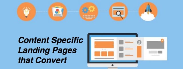
Now you know everything about landing page design, right? Here is an article by Andrew Smyk from the Adobe Dreamweaver team about the different types of landing pages. Recalling back to the first article in this series that defined a landing page, basically it is a page that is intended to convert a visitor to a lead in your inbound marketing database. Therefore, your standard pages on your website that educate visitors about your products or services in most cases are not landing pages.
We often create landing pages to execute a campaign and focus on a delivery of specific information. You will see examples of these in this article.

Content specific landing pages should be just that – web pages that focus on delivering specific messages to your audience to accomplish specific goals and grow conversions through calls to action. The specific functions of landing pages can cover everything from sales (lead generation) to informational newsrooms and beyond.
Whereas, homepages tend to be general and offer more casual informational content to the user, landing pages have a specific function and curated content.
Stop Going Around and Around to Get Started
Before starting on any landing page or microsite project, the first design consideration is to drop the use of a banner or image carousel. Click through rates on carousels are extremely low, so using them is counterpro...
This last article provides tips to supercharge landing pages that are intended for use on mobile devices. Mobile traffic has surpassed desktop traffic last year, therefore it is an important medium for your marketing efforts. Some businesses think that even though their current website analytics do not show more than 50% traffic from mobile devices, this could be caused by not having a responsive website design. In any case, mobile is a critical platform for attracting visitors and leads to your business. Enjoy these tips from the author, Khalid Saleh, from conversion optimization company, Invesp.

Mobile users have very different goals than website users. Screen size, device type and context dramatically change what users want from your site.
This is why the best practices that apply to desktop landing pages rarely apply to mobiles.
If you want to create delightful, function and conversion-oriented mobile landing pages, here are six best practices you need to follow:
- Focus on Simplification
- As the first step when creating a mobile website, focus on what not to include instead of what to include.
- The logo and short headlines are fine, but a form that has more than three fields is probably not a good idea.
- It is important to make sure the user takes the least number of steps from the entry point to making a purchase. Eliminat...
We hope you enjoyed this article and are on your way to creating the perfect landing pages. To help you further in your quest for website perfection, please enjoy these 25 website must-haves for driving traffic, leads and sales!
Ask us about our unique approach that creates a full-funnel "inbound" engagement model for your business that attracts and converts digitally engaged prospects.